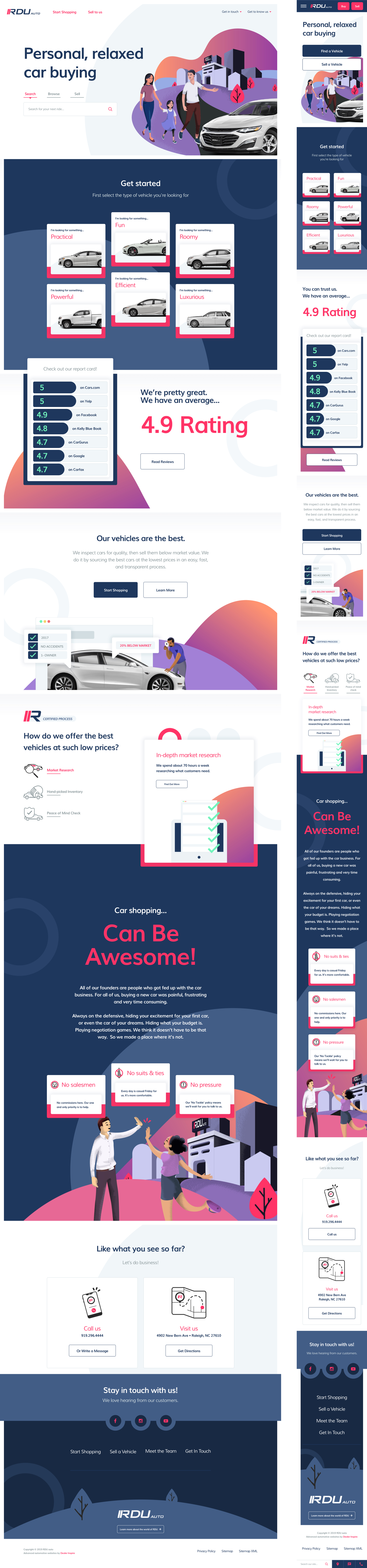
RDU sought to change the way people in their area buy cars. They needed a way to explain how they plan to do that, and reach a wide audience. So they came to me.
MY ROLE
UI/UX designer, Illustrator
THE OPPORTUNITY
RDU, like many auto dealerships, has a choice of maybe 3 providers to host a website. Those providers typically have very limited options as far as customization goes. They offer no creative services, and do not offer to work with the client to create what they need.
THE SOLUTION
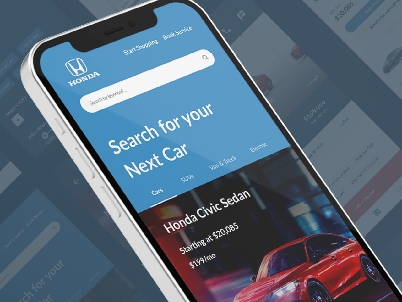
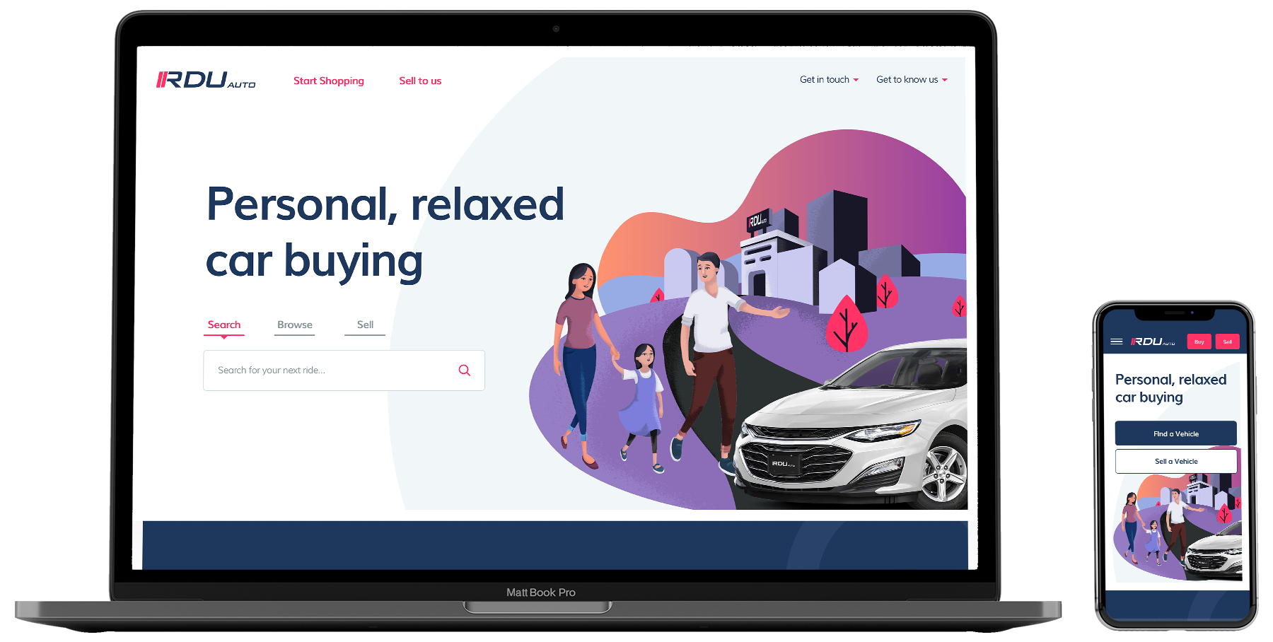
A re-brand of RDU, accompanied by a new website that illustrates (literally) what makes them unique within the automotive space. Try it out.
1 – STYLE
APPROACHABILITY FIRST
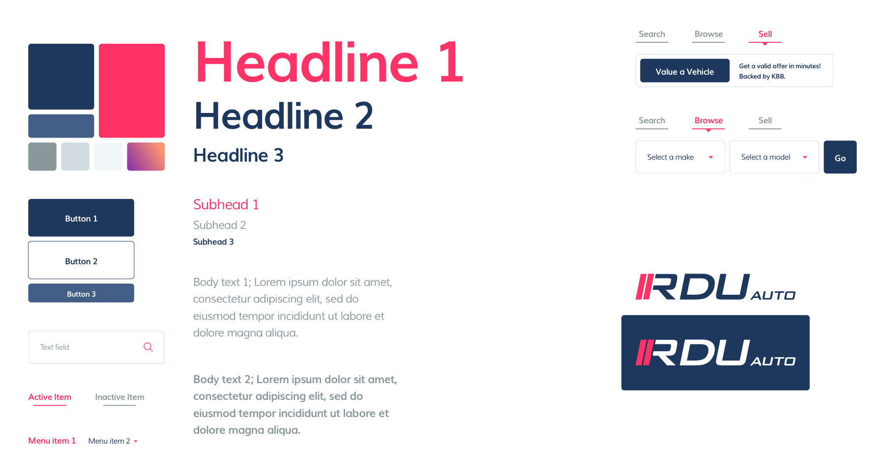
Making people comfortable, and relaxed while browsing their site is a key goal. Friendly imagery, warm autumn colors, and an illustrative style help to build trust with users.
2 – ILLUSTRATION
RELATABILITY & TRUST
Expanding on the style, the majority of imagery on the site is illustrative. The style is relaxing and inviting, presenting the sales process as thoughtful by having accompanying steps illustrated in a friendly manner.

3 – ICONOGRAPHY
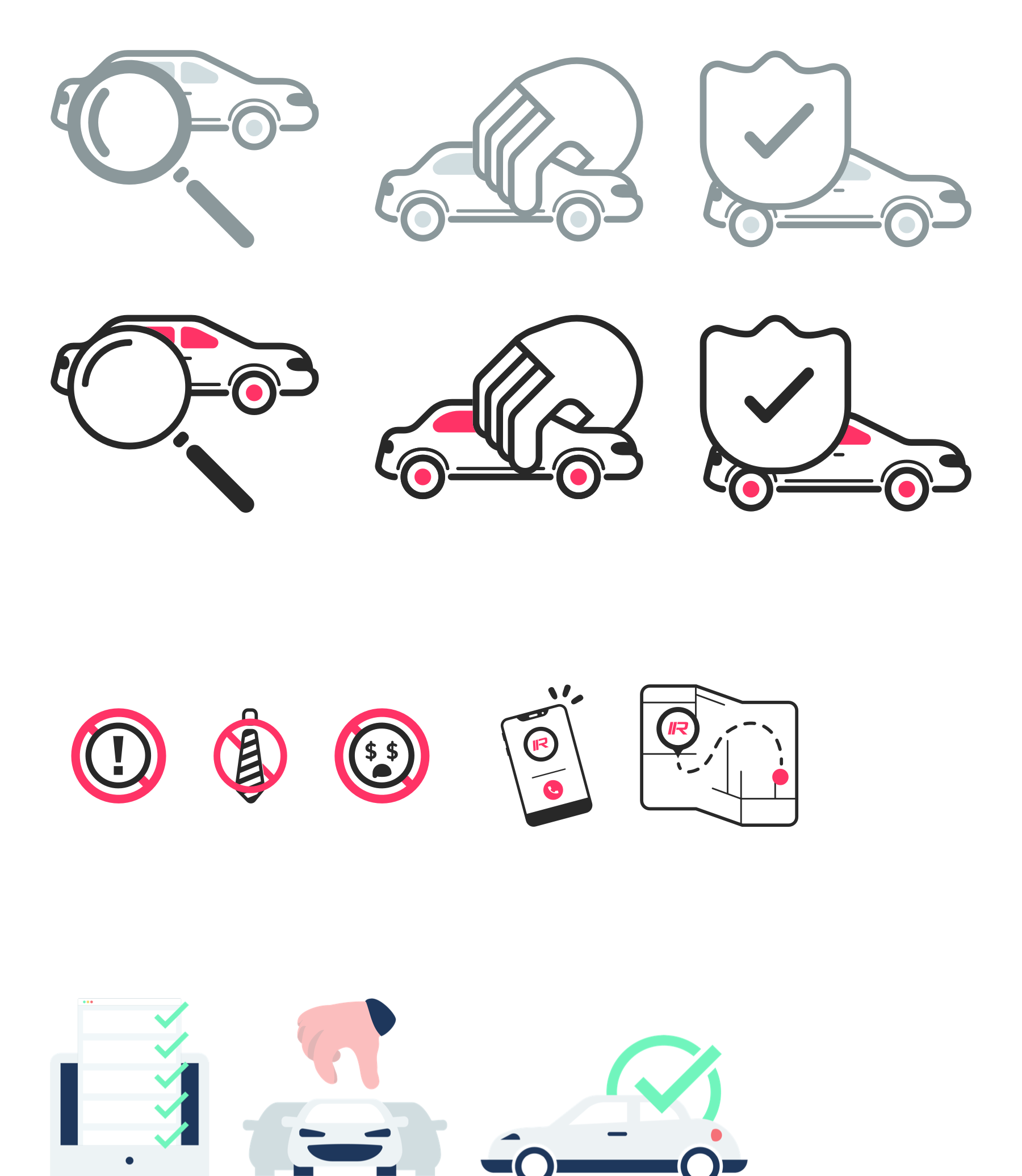
IT'S THE LITTLE THINGS
To fully explain the RDU process, I devised a set of icons that cohesively represent different steps in the shopping process, and explain different calls to action.
4 – LAYOUT
PUTTING THE PIECES IN PLACE
The final result of the rebranded site is a useable and friendly style. The layout is built to funnel shoppers into inventory first, and educate curious users that scroll below the fold with fun illustrations.